The Best Bedding Colours for 2026
2026 is the year bedrooms stopped hedging. Designers are moving away from safe, cool-toned neutrals and committing to colour warm, grounded, and a little more personal. Here are the five palettes leading the way, and how to bring each one home.
For years, the safe bedroom formula was white sheets, grey walls, done. It's still a perfectly good foundation but 2026's shift is about what you build on top of it. Rather than chasing a single "colour of the year," designers are working with warmer, more grounded palettes across the board: colours borrowed from clay, stone, foliage and dusk rather than a paint chip.
The common thread across all five trends below is warmth. Even the cooler tones sage, smoky blue are being pulled toward earthy, natural undertones rather than the stark, cold shades that dominated bedrooms for the last decade.
Warm Terracotta & Clay
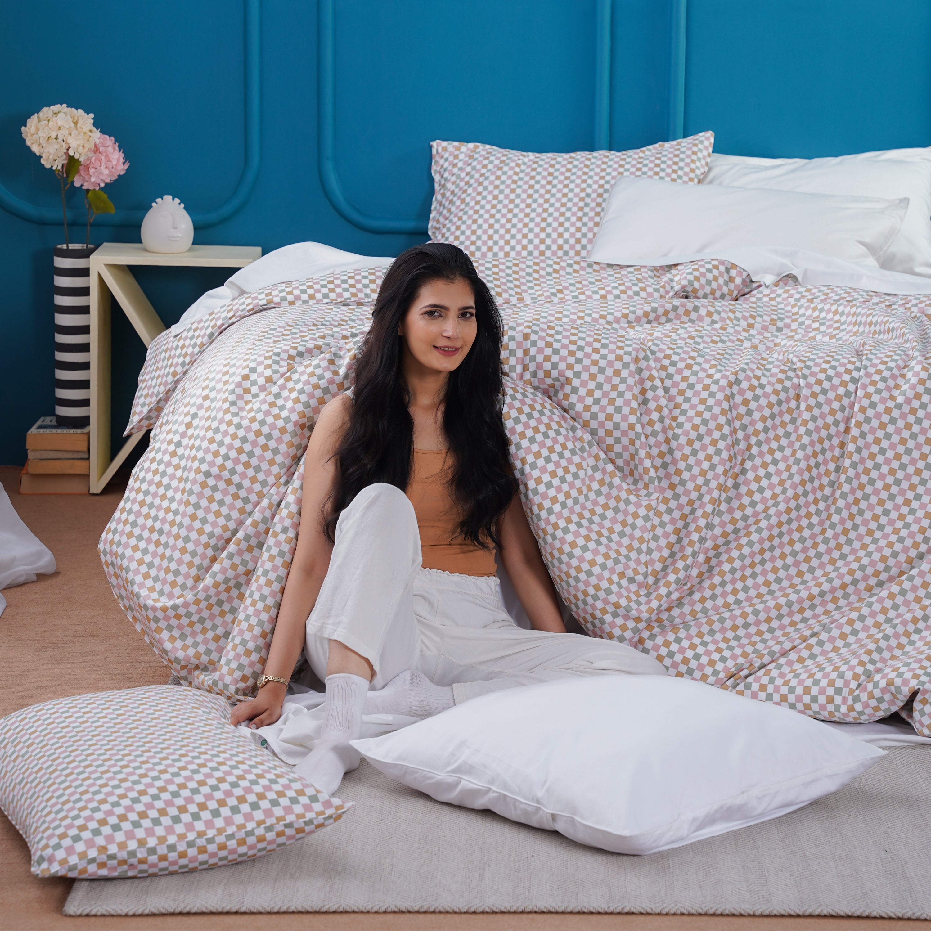
Terracotta has moved from the plant pot to the bed. It's one of the clearest signals of 2026's broader shift toward nature-inspired warm neutrals wheat, caramel and clay tones that feel considered rather than trend-chasing. On bedding, it works best as a mid-weight layer rather than the whole scheme: a duvet cover or throw against a warm, undyed base.
It's forgiving, too. Because it sits closer to a natural pigment than a saturated paint colour, terracotta pairs easily with wood tones, brass hardware and most existing neutral bedrooms no repaint required.
Sage as the New Neutral
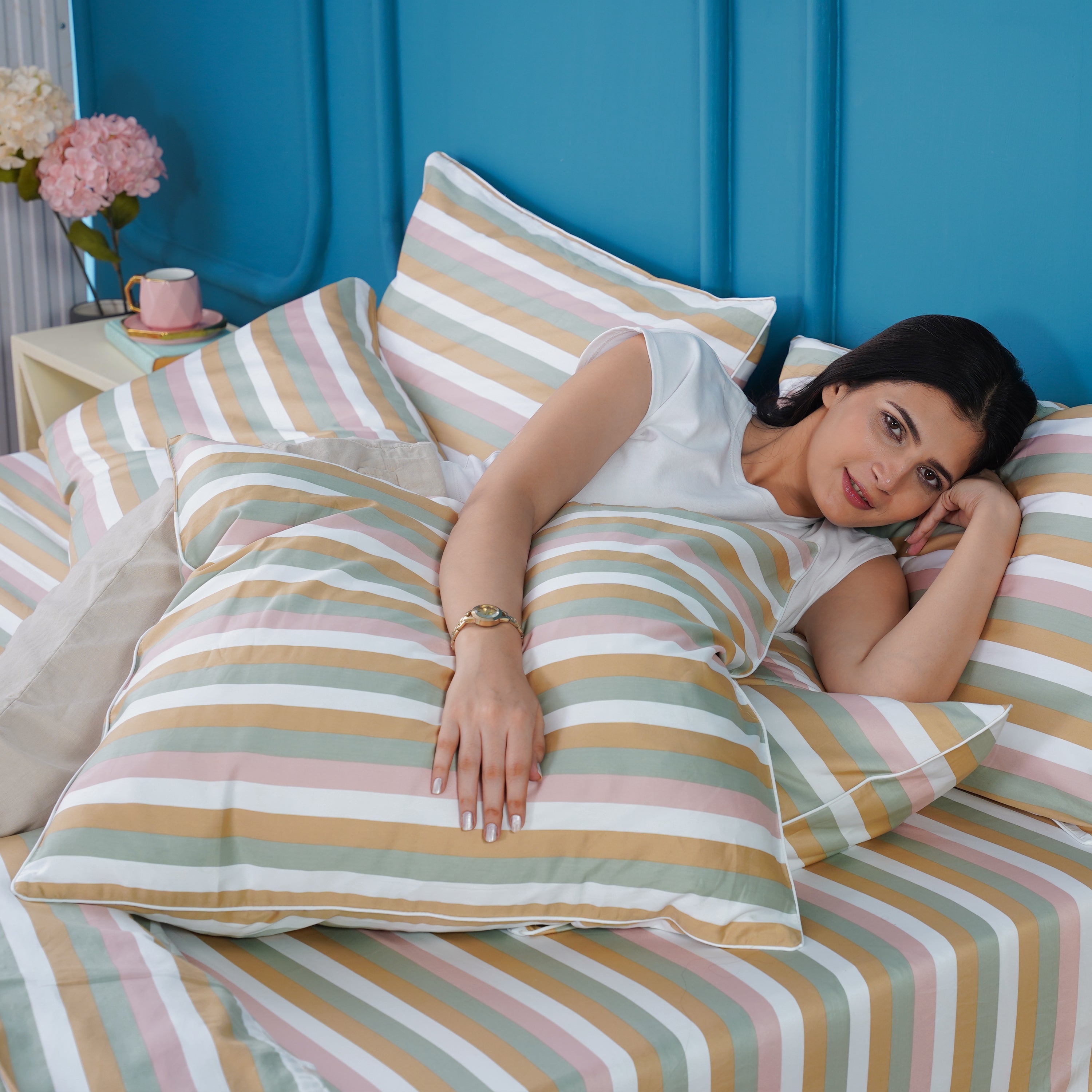
Sage has quietly graduated from "accent colour" to genuine neutral status in 2026. Where it used to appear as a single cushion or a feature wall, designers are now using it as the dominant tone across an entire palette the same role white or grey used to play, but with far more warmth and restfulness built in.
The trick to making it feel current rather than a decade-old "spa bathroom" colour is undertone: this year's sage leans slightly warmer and more muted than the cooler, minty sage of years past.
Deep Smoky Blue
Bright, primary blue doesn't suit a bedroom it's too energising for a room meant to help you switch off. The blue trending for 2026 is a deeper, cooler-toned shade with a touch of green mixed in, giving it a smoky, almost dusk-like quality. It reads as sophisticated rather than stimulating, which is exactly why designers are reaching for it in darker, more dramatic bedrooms.
Because it's a strong, saturated colour, smoky blue works best used with restraint a duvet cover or a single upholstered element, not every surface in the room at once.
Elevated Blush & Mauve
Pink isn't disappearing in 2026 it's maturing. Bright, sugary pink is being replaced by dustier, more muted shades: blush, mauve, faded rose. These read as sophisticated rather than sweet, which is why they're turning up in primary bedrooms that would never have gone near pink a few years ago.
The muted undertone is what makes it work for adults it behaves more like a warm neutral than a true "pink," so it sits comfortably alongside wood, brass and deeper accent colours without feeling themed.
Wheat, Caramel & Warm Greige
Not every 2026 bedroom is reaching for bold colour, and that's a trend in itself. Flat, cool-toned beige is on its way out, replaced by neutrals with a genuine warm undertone wheat, caramel, oatmeal, warm greige. The difference is subtle in a swatch and obvious in a room: warm neutrals feel inviting, cool ones feel a little clinical.
This palette is the easiest of the five to commit to, since it functions as a true neutral base you can layer any of the other four trends over, one season at a time.
Building a 2026 Palette on What You Already Own
You don't need to repaint or replace every layer to bring a trend home. The 60/30/10 ratio used in each palette above is the easiest shortcut: a dominant neutral base (60%), a colour statement on the duvet (30%), and a small, confident accent in pillows or a throw (10%).
Start with the layer that's easiest to change usually the duvet cover or a single accent pillow before committing to a full sheet set in a new colour.
If you're only changing one thing, change the duvet cover. It's the largest visible surface on the bed and the fastest way to shift the whole room's palette without touching walls, furniture or fitted sheets.
- Choose one dominant trend colour, not two competing ones
- Keep your base layer (fitted sheet) neutral so you can rotate colours seasonally
- Use the accent colour in one place only a pillow, a throw, never both
- Check undertones in daylight before committing to a full set
- Let texture do some of the work a muted colour in a textured weave reads richer than the same colour flat
Start With the Base Layer
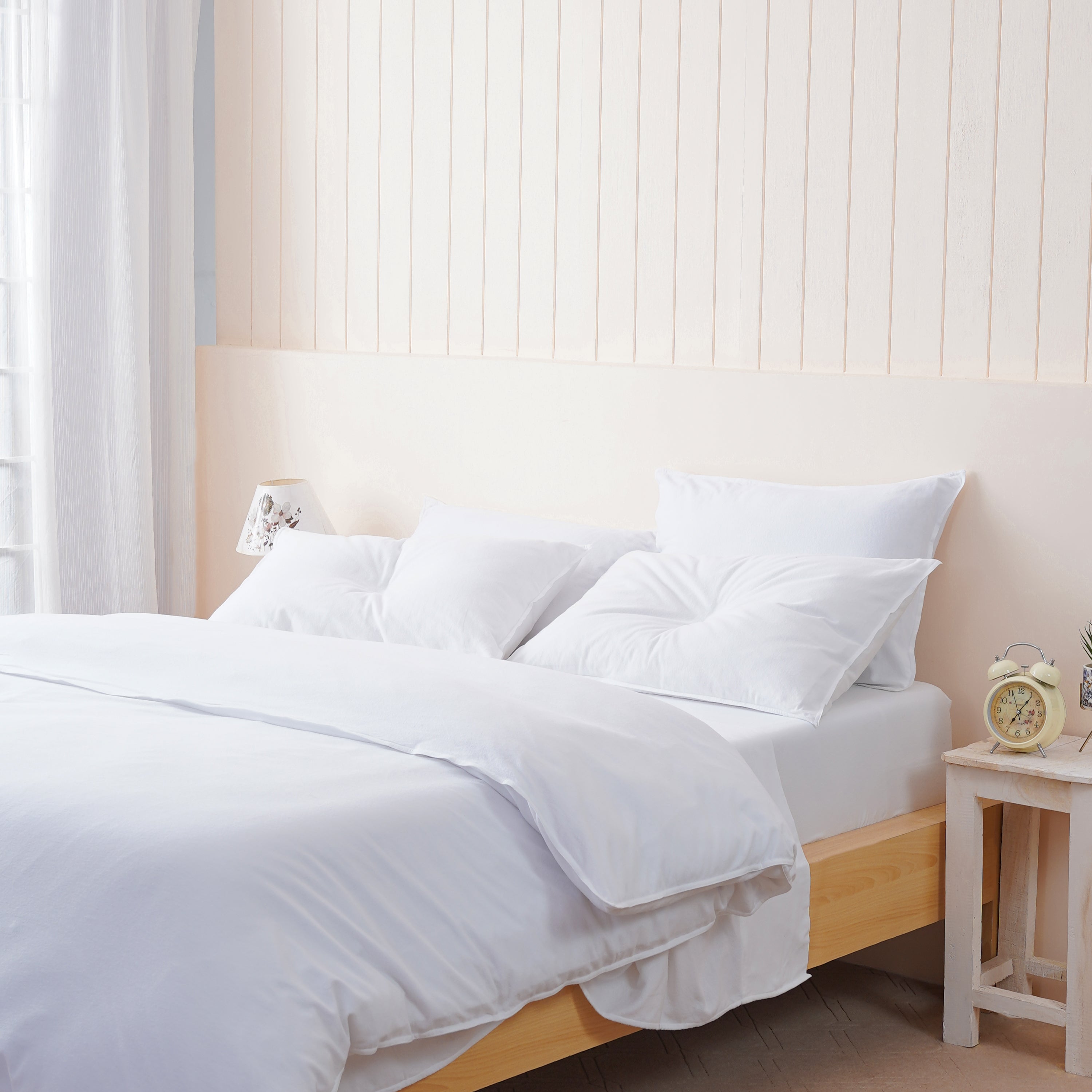
Every 2026 palette starts with a neutral you can build on. Shop Sheet Story's bedding to lay your foundation.
Shop BeddingFrequently Asked Questions
What is the most popular bedding colour for 2026?
Warm, earthy neutrals wheat, caramel and terracotta are the most widely used base palette for 2026, with sage green established as an equally popular foundational neutral rather than just an accent.
Is grey bedding still on trend in 2026?
Cool-toned grey and beige are fading in favour of warmer alternatives. If you already own grey bedding, layering a warm accent colour like terracotta or blush on top will bring it in line with the current palette.
How do I use bold colour without making my bedroom too busy?
Follow a 60/30/10 ratio a neutral base making up the majority of the bed, a colour statement on the duvet cover, and a small accent in one pillow or throw only.
What colour bedding makes a small bedroom feel bigger?
A warm, light neutral base such as oatmeal or warm white keeps a small room feeling open, while a single richer accent colour on the duvet or one pillow adds interest without visually shrinking the space.